- Published on
Practical Guide: Create A Accessible Pagination With Tailwind CSS
- What is Tailwind CSS?
- The description of Accessible Pagination ui component
- Why use Tailwind CSS to create a Accessible Pagination ui component?
- The preview of Accessible Pagination ui component
- The source code of Accessible Pagination ui component
- How to create a Accessible Pagination with Tailwind CSS?
- Conclusion
As a FrontEnd technology blogger, it is important to create accessible user interfaces. One of the most important elements of a user interface is pagination. Pagination allows users to navigate through a large amount of content easily. In this article, we will discuss how to create an accessible pagination with Tailwind CSS.
What is Tailwind CSS?
Tailwind CSS is a utility-first CSS framework that allows developers to quickly create custom designs. It provides a set of pre-defined classes that can be used to style HTML elements. Tailwind CSS is highly customizable and allows developers to create unique designs without writing any CSS code.
The description of Accessible Pagination ui component
Pagination is a user interface component that allows users to navigate through a large amount of content. Accessible pagination is a pagination component that is designed to be accessible to all users, including those with disabilities. Accessible pagination is designed to be easy to use and easy to understand.
Why use Tailwind CSS to create a Accessible Pagination ui component?
Tailwind CSS is a great choice for creating an accessible pagination component. It provides a set of pre-defined classes that can be used to style HTML elements. This makes it easy to create a custom design without writing any CSS code. Tailwind CSS is also highly customizable, which allows developers to create unique designs.
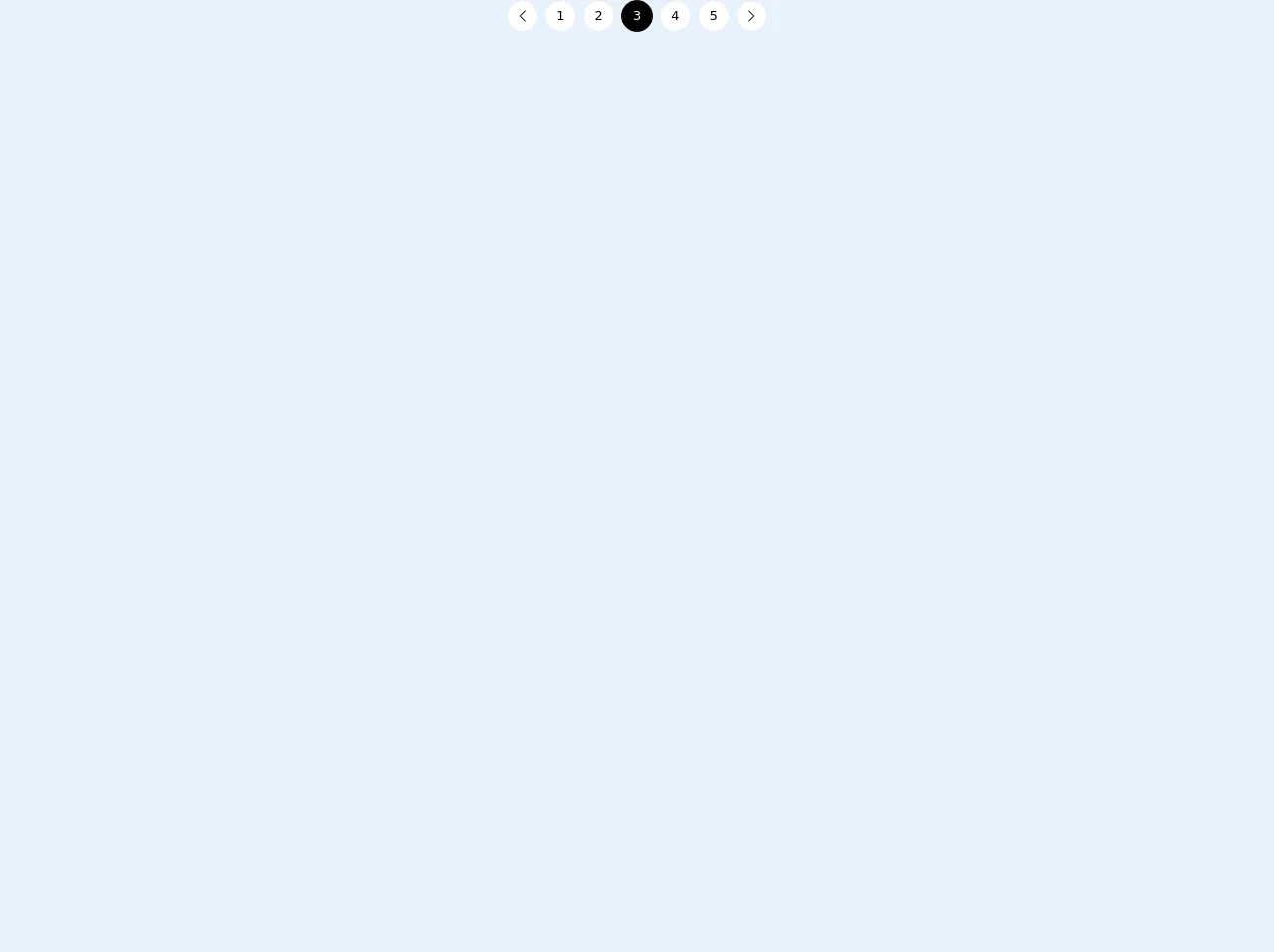
The preview of Accessible Pagination ui component
To create an accessible pagination component, we will use Tailwind CSS. The pagination component will be designed to be accessible to all users, including those with disabilities. The pagination component will be easy to use and easy to understand.
Free download of the Accessible Pagination's source code
The source code of Accessible Pagination ui component
To create an accessible pagination component, we will use HTML and CSS code. The HTML code will be used to create the pagination component, and the CSS code will be used to style the component.
<nav
  class="flex flex-row flex-nowrap items-center justify-between md:justify-center"
  aria-label="Pagination"
>
  <a
    class="mr-1 flex h-10 w-10 items-center justify-center rounded-full border border-gray-200 bg-white text-black hover:border-gray-300"
    href="#"
    title="Previous Page"
  >
    <span class="sr-only">Previous Page</span>
    <svg
      class="block h-4 w-4 fill-current"
      viewBox="0 0 256 512"
      aria-hidden="true"
      role="presentation"
    >
      <path
        d="M238.475 475.535l7.071-7.07c4.686-4.686 4.686-12.284 0-16.971L50.053 256 245.546 60.506c4.686-4.686 4.686-12.284 0-16.971l-7.071-7.07c-4.686-4.686-12.284-4.686-16.97 0L10.454 247.515c-4.686 4.686-4.686 12.284 0 16.971l211.051 211.05c4.686 4.686 12.284 4.686 16.97-.001z"
      ></path>
    </svg>
  </a>
  <a
    class="mx-1 hidden h-10 w-10 items-center justify-center rounded-full border border-gray-200 bg-white text-black hover:border-gray-300 md:flex"
    href="#"
    title="Page 1"
  >
    1
  </a>
  <a
    class="mx-1 hidden h-10 w-10 items-center justify-center rounded-full border border-gray-200 bg-white text-black hover:border-gray-300 md:flex"
    href="#"
    title="Page 2"
  >
    2
  </a>
  <a
    class="pointer-events-none mx-1 hidden h-10 w-10 items-center justify-center rounded-full border border-black bg-black text-white md:flex"
    href="#"
    aria-current="page"
    title="Page 3"
  >
    3
  </a>
  <a
    class="mx-1 hidden h-10 w-10 items-center justify-center rounded-full border border-gray-200 bg-white text-black hover:border-gray-300 md:flex"
    href="#"
    title="Page 4"
  >
    4
  </a>
  <a
    class="mx-1 hidden h-10 w-10 items-center justify-center rounded-full border border-gray-200 bg-white text-black hover:border-gray-300 md:flex"
    href="#"
    title="Page 5"
  >
    5
  </a>
  <a
    class="ml-1 flex h-10 w-10 items-center justify-center rounded-full border border-gray-200 bg-white text-black hover:border-gray-300"
    href="#"
    title="Next Page"
  >
    <span class="sr-only">Next Page</span>
    <svg
      class="block h-4 w-4 fill-current"
      viewBox="0 0 256 512"
      aria-hidden="true"
      role="presentation"
    >
      <path
        d="M17.525 36.465l-7.071 7.07c-4.686 4.686-4.686 12.284 0 16.971L205.947 256 10.454 451.494c-4.686 4.686-4.686 12.284 0 16.971l7.071 7.07c4.686 4.686 12.284 4.686 16.97 0l211.051-211.05c4.686-4.686 4.686-12.284 0-16.971L34.495 36.465c-4.686-4.687-12.284-4.687-16.97 0z"
      ></path>
    </svg>
  </a>
</nav>
How to create a Accessible Pagination with Tailwind CSS?
To create an accessible pagination component with Tailwind CSS, follow these steps:
- Create a HTML element for the pagination component.
- Add the necessary classes to the HTML element using Tailwind CSS.
- Add the necessary attributes to the HTML element to make it accessible.
- Style the pagination component using Tailwind CSS.
Here is an example of HTML code for a pagination component:
<nav class="pagination" aria-label="Pagination">
  <ul class="flex justify-center">
    <li class="pagination-item">
      <a href="#" class="pagination-link" aria-label="Go to page 1">1</a>
    </li>
    <li class="pagination-item">
      <a href="#" class="pagination-link" aria-label="Go to page 2">2</a>
    </li>
    <li class="pagination-item">
      <a href="#" class="pagination-link" aria-label="Go to page 3">3</a>
    </li>
  </ul>
</nav>
In this example, we have created a nav element with a class of pagination. We have also added an aria-label attribute to the nav element to make it accessible. Inside the nav element, we have created a ul element with a class of flex justify-center. This will center the pagination links horizontally. Inside the ul element, we have created three li elements with a class of pagination-item. Inside each li element, we have created an a element with a class of pagination-link. We have also added an aria-label attribute to each a element to make it accessible.
Here is an example of CSS code for styling the pagination component:
.pagination {
  display: inline-block;
  padding: 0.5rem;
  border-radius: 0.25rem;
  background-color: #fff;
  box-shadow: 0 1px 2px rgba(0, 0, 0, 0.05);
}

.pagination-item {
  margin-left: 0.5rem;
}

.pagination-link {
  display: inline-block;
  padding: 0.25rem 0.5rem;
  border-radius: 0.25rem;
  color: #4a5568;
  background-color: transparent;
  transition: all 0.2s ease-in-out;
}

.pagination-link:hover {
  background-color: #edf2f7;
}
In this example, we have styled the pagination class to give it a white background and a box shadow. We have also added some padding and border radius to make it look more like a button. We have styled the pagination-item class to add some margin between the pagination links. We have styled the pagination-link class to give it a transparent background and a border radius. We have also added a hover effect to the pagination-link class to make it more interactive.
Conclusion
In this article, we have discussed how to create an accessible pagination with Tailwind CSS. We have discussed the benefits of using Tailwind CSS to create an accessible pagination component. We have also provided a preview and source code for the pagination component. By following the steps outlined in this article, you can create an accessible pagination component that is easy to use and easy to understand.