- Published on
How To Build A A Simple Mobile Navbar Low Style With Tailwind CSS In 6 Easy Steps?
- What is Tailwind CSS?
- The description of A Simple Mobile Navbar Low Style ui component
- Why use Tailwind CSS to create a A Simple Mobile Navbar Low Style ui component?
- The preview of A Simple Mobile Navbar Low Style ui component
- The source code of A Simple Mobile Navbar Low Style ui component
- How to create a A Simple Mobile Navbar Low Style with Tailwind CSS?
- Step 1: Create the HTML structure
- Step 2: Add Tailwind CSS
- Step 3: Style the navigation menu
- Step 4: Add media queries
- Step 5: Test the navigation menu
- Step 6: Deploy the navigation menu
- Conclusion
As a FrontEnd technology blogger, it is important to stay up-to-date with the latest web development tools and techniques. One tool that has gained popularity in recent years is Tailwind CSS. In this article, we will walk through how to build a simple mobile navbar low style using Tailwind CSS in 6 easy steps.
What is Tailwind CSS?
Tailwind CSS is a utility-first CSS framework that allows developers to quickly and easily create custom user interfaces. It provides a set of pre-defined CSS classes that can be used to style HTML elements. With Tailwind CSS, developers can focus on building their application rather than writing custom CSS.
The description of A Simple Mobile Navbar Low Style ui component
A Simple Mobile Navbar Low Style is a user interface component that is commonly used in mobile applications. It consists of a navigation menu that is displayed at the bottom of the screen. This type of navigation is particularly useful on mobile devices where screen real estate is limited.
Why use Tailwind CSS to create a A Simple Mobile Navbar Low Style ui component?
Tailwind CSS provides a set of pre-defined CSS classes that can be used to style HTML elements. This makes it easy to create a custom user interface without having to write custom CSS. Additionally, Tailwind CSS is highly customizable, which allows developers to create unique designs that match their brand.
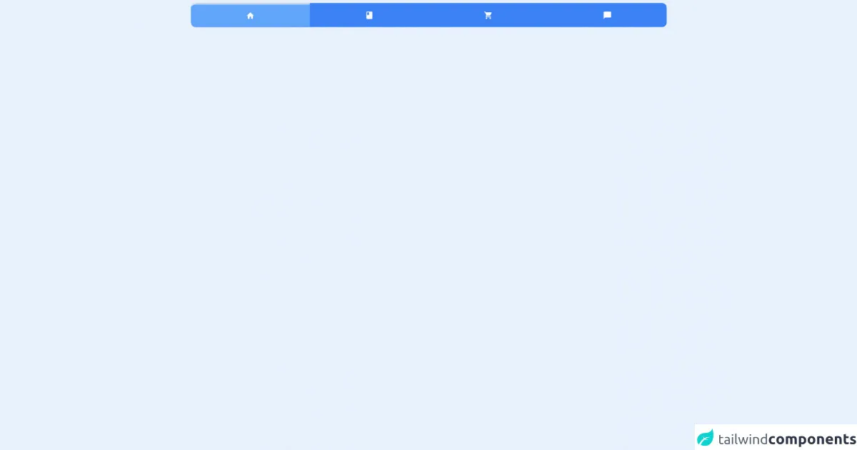
The preview of A Simple Mobile Navbar Low Style ui component
To create a Simple Mobile Navbar Low Style ui component, we will use Tailwind CSS. The final result will look something like this:
Free download of the A Simple Mobile Navbar Low Style's source code
The source code of A Simple Mobile Navbar Low Style ui component
To create the Simple Mobile Navbar Low Style ui component, we will need to write some HTML and CSS. The HTML code will define the structure of the navigation menu, while the CSS code will style the menu. Here is the source code:
<div class="flex flex-col justify-around">
  <div class="border-box bottom-0 h-20 w-full p-2">
    <link href="https://fonts.googleapis.com/icon?family=Material+Icons" rel="stylesheet" />
    <div class="flex h-full w-full justify-around rounded-xl bg-blue-500 text-white">
      <div
        class="below-menu-holder flex w-1/4 justify-around rounded-bl-xl rounded-tl-xl border-t-4 bg-blue-400 duration-700"
      >
        <span class="material-icons self-center">home</span>
      </div>
      <div class="below-menu-holder flex w-1/4 justify-around duration-700">
        <span class="material-icons self-center">book</span>
      </div>
      <div class="below-menu-holder  flex w-1/4 justify-around duration-700">
        <span class="material-icons self-center">shopping_cart</span>
      </div>
      <div
        class="below-menu-holder flex w-1/4 justify-around rounded-tr-xl rounded-br-xl duration-700"
      >
        <span class="material-icons self-center">chat_bubble</span>
      </div>
    </div>
    <script>
      const holder = document.getElementsByClassName('below-menu-holder')

      var active = 0

      function activate() {
        for (let x = 0; x < holder.length; x++) {
          if (x == active) {
            holder[x].classList.add('border-t-4', 'bg-blue-400')
          } else {
            holder[x].classList.remove('border-t-4', 'bg-blue-400')
          }
        }
      }

      for (let x = 0; x < holder.length; x++) {
        holder[x].addEventListener('click', () => {
          active = x
          activate()
        })
      }
    </script>
  </div>
</div>
How to create a A Simple Mobile Navbar Low Style with Tailwind CSS?
Now that we have an understanding of what Tailwind CSS is and why it is useful, let's dive into how to create a Simple Mobile Navbar Low Style ui component using Tailwind CSS.
Step 1: Create the HTML structure
The first step is to create the HTML structure for the navigation menu. We will use a nav element with a ul element inside. Each li element will represent a navigation item. Here is the HTML code:
<nav class="bg-gray-800">
  <ul class="flex justify-between px-4 py-2">
    <li>
      <a href="#" class="text-gray-300 hover:text-white">Home</a>
    </li>
    <li>
      <a href="#" class="text-gray-300 hover:text-white">About</a>
    </li>
    <li>
      <a href="#" class="text-gray-300 hover:text-white">Contact</a>
    </li>
  </ul>
</nav>
Step 2: Add Tailwind CSS
The next step is to add the Tailwind CSS framework to our project. We can do this by including the Tailwind CSS stylesheet in the head section of our HTML file:
<head>
  <link rel="stylesheet" href="https://cdn.jsdelivr.net/npm/[email protected]/dist/tailwind.min.css">
</head>
Step 3: Style the navigation menu
Now that we have the HTML structure in place and have included the Tailwind CSS framework, we can start styling the navigation menu. We will use a combination of Tailwind CSS classes to achieve the desired look and feel. Here is the CSS code:
/* Set the background color of the navigation menu */
.bg-gray-800 {
  background-color: #1f2937;
}

/* Center the navigation items and add padding */
.flex {
  display: flex;
  align-items: center;
}

.justify-between {
  justify-content: space-between;
}

.px-4 {
  padding-left: 1rem;
  padding-right: 1rem;
}

.py-2 {
  padding-top: 0.5rem;
  padding-bottom: 0.5rem;
}

/* Style the navigation items */
.text-gray-300 {
  color: #d1d5db;
}

.hover\:text-white:hover {
  color: #fff;
}
Step 4: Add media queries
To make the navigation menu responsive on mobile devices, we will need to add some media queries. We will use Tailwind CSS's built-in media query classes to achieve this. Here is the updated CSS code:
/* Set the background color of the navigation menu */
.bg-gray-800 {
  background-color: #1f2937;
}

/* Center the navigation items and add padding */
.flex {
  display: flex;
  align-items: center;
}

.justify-between {
  justify-content: space-between;
}

.px-4 {
  padding-left: 1rem;
  padding-right: 1rem;
}

.py-2 {
  padding-top: 0.5rem;
  padding-bottom: 0.5rem;
}

/* Style the navigation items */
.text-gray-300 {
  color: #d1d5db;
}

.hover\:text-white:hover {
  color: #fff;
}

/* Add media queries for mobile devices */
@media (max-width: 640px) {
  .flex {
    flex-direction: column;
  }

  .justify-between {
    justify-content: flex-start;
  }

  .px-4 {
    padding-left: 0;
    padding-right: 0;
  }

  .py-2 {
    padding-top: 1rem;
    padding-bottom: 1rem;
  }
}
Step 5: Test the navigation menu
At this point, we have created the HTML structure and styled the navigation menu using Tailwind CSS. We have also added media queries to make the menu responsive on mobile devices. The final step is to test the navigation menu to ensure it works as expected.
Step 6: Deploy the navigation menu
Once we are satisfied with the navigation menu, we can deploy it to our application. We can copy the HTML and CSS code into our project and customize it as needed.
Conclusion
In this article, we have walked through how to build a simple mobile navbar low style using Tailwind CSS in 6 easy steps. We started by discussing what Tailwind CSS is and why it is useful. We then created the HTML structure and styled the navigation menu using Tailwind CSS. Finally, we added media queries to make the menu responsive on mobile devices. By following these steps, we can create a custom navigation menu that looks great on any device.