- Published on
Ultimate Guide: Build A A Card Skeleton For Loading With Tailwind CSS
- What is Tailwind CSS?
- The description of A card skeleton for loading UI component
- Why use Tailwind CSS to create a card skeleton for loading UI component?
- The preview of A card skeleton for loading UI component
- The source code of A card skeleton for loading UI component
- How to create a card skeleton for loading with Tailwind CSS?
- Step 1: Create the HTML structure
- Step 2: Add Tailwind CSS classes
- Step 3: Add the card skeleton to your project
- Conclusion
In this tutorial, we will be building a card skeleton for loading UI component using Tailwind CSS. We will go through the step-by-step process of creating this component and explain why Tailwind CSS is the perfect tool for this task.
What is Tailwind CSS?
Tailwind CSS is a utility-first CSS framework that provides a set of pre-defined classes that can be used to style HTML elements. It allows developers to quickly create complex layouts and designs without having to write custom CSS.
The description of A card skeleton for loading UI component
A card skeleton for loading is a UI component that is used to display a placeholder while content is being loaded. It is commonly used in web applications to improve the user experience by providing visual feedback to the user that something is happening in the background.
Why use Tailwind CSS to create a card skeleton for loading UI component?
Tailwind CSS is the perfect tool for creating a card skeleton for loading UI component because it provides a set of pre-defined classes that can be used to style HTML elements. This allows developers to quickly create complex layouts and designs without having to write custom CSS.
Tailwind CSS also provides a responsive design system that allows developers to create designs that work on different screen sizes. This is important for creating a card skeleton for loading UI component that looks good on both desktop and mobile devices.
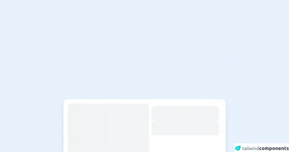
The preview of A card skeleton for loading UI component
To create a card skeleton for loading UI component, we will be using Tailwind CSS classes to style a div element. The result will be a card skeleton that looks like this:
Free download of the A card skeleton for loading's source code
The source code of A card skeleton for loading UI component
To create the card skeleton for loading UI component, we will be using the following HTML and Tailwind CSS code:
<div
  class="flex select-none flex-col gap-5 rounded-2xl bg-white p-2 shadow-lg sm:h-64 sm:flex-row sm:p-4 "
>
  <div class="h-52 animate-pulse rounded-xl bg-gray-200 sm:h-full sm:w-72"></div>
  <div class="flex flex-1 flex-col gap-5 sm:p-2">
    <div class="flex flex-1 flex-col gap-3">
      <div class="h-14 w-full animate-pulse rounded-2xl bg-gray-200"></div>
      <div class="h-3 w-full animate-pulse rounded-2xl bg-gray-200"></div>
      <div class="h-3 w-full animate-pulse rounded-2xl bg-gray-200"></div>
      <div class="h-3 w-full animate-pulse rounded-2xl bg-gray-200"></div>
      <div class="h-3 w-full animate-pulse rounded-2xl bg-gray-200"></div>
    </div>
    <div class="mt-auto flex gap-3">
      <div class="h-8 w-20 animate-pulse rounded-full bg-gray-200"></div>
      <div class="h-8 w-20 animate-pulse rounded-full bg-gray-200"></div>
      <div class="ml-auto h-8 w-20 animate-pulse rounded-full bg-gray-200"></div>
    </div>
  </div>
</div>
How to create a card skeleton for loading with Tailwind CSS?
Now that we have an understanding of what Tailwind CSS is and why it is the perfect tool for creating a card skeleton for loading UI component, let's dive into the step-by-step process of creating this component.
Step 1: Create the HTML structure
The first step is to create the HTML structure for the card skeleton. We will be using a div element to create the card skeleton. Here is the HTML code:
<div class="bg-white rounded-lg p-6 flex flex-col justify-between leading-tight">
  <div class="animate-pulse">
    <div class="bg-gray-300 h-4 w-1/2 mb-2"></div>
    <div class="bg-gray-300 h-4 w-1/3 mb-2"></div>
    <div class="bg-gray-300 h-4 w-3/4"></div>
  </div>
  <div class="mt-4">
    <div class="bg-gray-300 h-4 w-1/4 mb-2"></div>
    <div class="bg-gray-300 h-4 w-1/2"></div>
  </div>
</div>
Step 2: Add Tailwind CSS classes
Next, we will add Tailwind CSS classes to style the card skeleton. We will be using the following classes:
- bg-white: Sets the background color of the card to white.
- rounded-lg: Rounds the corners of the card.
- p-6: Adds padding to the card.
- flex: Makes the card a flex container.
- flex-col: Sets the direction of the flex container to column.
- justify-between: Aligns the items in the flex container to the top and bottom.
- leading-tight: Sets the line height of the text to be tighter.
- animate-pulse: Adds a pulsing animation to the card skeleton.
- bg-gray-300: Sets the background color of the skeleton to gray.
- h-4: Sets the height of the skeleton to 4 pixels.
- w-1/2, w-1/3, w-3/4, w-1/4: Sets the width of the skeleton to be a fraction of the container width.
- mb-2: Adds margin to the bottom of the skeleton.
- mt-4: Adds margin to the top of the second set of skeletons.
Here is the final HTML code with the Tailwind CSS classes added:
<div class="bg-white rounded-lg p-6 flex flex-col justify-between leading-tight">
  <div class="animate-pulse">
    <div class="bg-gray-300 h-4 w-1/2 mb-2"></div>
    <div class="bg-gray-300 h-4 w-1/3 mb-2"></div>
    <div class="bg-gray-300 h-4 w-3/4"></div>
  </div>
  <div class="mt-4">
    <div class="bg-gray-300 h-4 w-1/4 mb-2"></div>
    <div class="bg-gray-300 h-4 w-1/2"></div>
  </div>
</div>
Step 3: Add the card skeleton to your project
Finally, we can add the card skeleton to our project by copying the HTML code and pasting it where we want the card skeleton to appear.
Conclusion
In this tutorial, we have learned how to create a card skeleton for loading UI component using Tailwind CSS. We have seen how Tailwind CSS provides a set of pre-defined classes that can be used to style HTML elements and how it allows developers to quickly create complex layouts and designs without having to write custom CSS.
By following the step-by-step process outlined in this tutorial, you can create your own card skeleton for loading UI component and improve the user experience of your web application.