- Published on
6 Critical Skills To Create A 404 With Dark & Light Mode With Tailwind CSS Remarkably Well
- What is Tailwind CSS?
- The description of 404 with dark & light mode ui component
- Why use Tailwind CSS to create a 404 with dark & light mode ui component?
- The preview of 404 with dark & light mode ui component
- The source code of 404 with dark & light mode ui component
- How to create a 404 with dark & light mode with Tailwind CSS?
- 1. Set up your project
- 2. Add a custom background image
- 3. Add a search bar
- 4. Add a message
- 5. Add dark mode styles
- 6. Add JavaScript to toggle color scheme
- Conclusion
What is Tailwind CSS?
Tailwind CSS is a utility-first CSS framework that helps you build custom designs quickly. It provides a set of pre-defined CSS classes that you can use to style your HTML elements. With Tailwind CSS, you can create responsive and mobile-first layouts, customize your design system, and speed up your development process.
The description of 404 with dark & light mode ui component
A 404 page is a standard HTTP response code that indicates the requested page cannot be found. It's a common experience for website visitors, and it's essential to provide a helpful and engaging 404 page to improve user experience. A 404 page with dark & light mode UI component is a page that changes its color scheme based on the user's preference. It provides a better user experience by reducing eye strain and making the page more accessible.
Why use Tailwind CSS to create a 404 with dark & light mode ui component?
Tailwind CSS is an excellent choice for creating a 404 page with dark & light mode UI component because it provides a set of pre-defined utility classes that you can use to style your page quickly. It also has excellent support for responsive design, making it easy to create a mobile-friendly 404 page. Additionally, Tailwind CSS has a built-in dark mode feature that makes it easy to switch between light and dark mode styles.
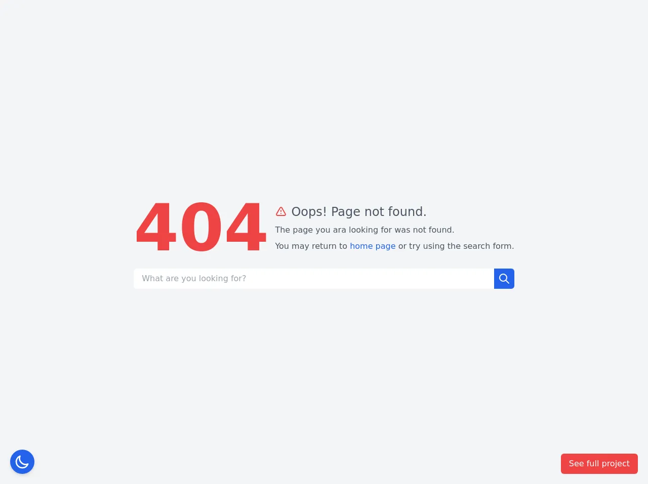
The preview of 404 with dark & light mode ui component
In this article, we will create a 404 page with dark & light mode UI component using Tailwind CSS. The page will have a custom background image, a search bar, and a message that encourages the user to return to the homepage. The page will change its color scheme based on the user's preference.
Free download of the 404 with dark & light mode's source code
The source code of 404 with dark & light mode ui component
To create a 404 page with dark & light mode UI component, we will use HTML, CSS, and Tailwind CSS. We will also use JavaScript to detect the user's preference and toggle the color scheme.
<style>
  /* This example part of kwd-dashboard see https://kamona-wd.github.io/kwd-dashboard/ */
  /* So here we will write some classes to simulate dark mode and tailwind css config in our project */
  :root {
    --light: #edf2f9;
    --dark: #152e4d;
    --darker: #12263f;
  }

  .dark .dark\:text-light {
    color: var(--light);
  }

  .dark .dark\:bg-dark {
    background-color: var(--dark);
  }

  .dark .dark\:bg-darker {
    background-color: var(--darker);
  }

  .dark .dark\:text-gray-300 {
    color: #d1d5db;
  }
</style>

<script src="https://cdn.jsdelivr.net/gh/alpinejs/[email protected]/dist/alpine.min.js" defer></script>

<div x-data="setup()" x-init="$refs.loading.classList.add('hidden');" :class="{ 'dark': isDark }">
  <!-- Loading screen -->
  <div
    x-ref="loading"
    class="fixed inset-0 z-50 flex items-center justify-center bg-black bg-opacity-90 text-2xl font-semibold text-white"
  >
    Loading.....
  </div>
  <main
    aria-labelledby="pageTitle"
    class="dark:bg-dark dark:text-light flex h-screen items-center justify-center bg-gray-100"
  >
    <div class="space-y-4 p-4">
      <div
        class="flex flex-col items-start space-y-3 sm:flex-row sm:items-center sm:space-y-0 sm:space-x-3"
      >
        <p class="text-9xl font-semibold text-red-500 dark:text-red-600">404</p>
        <div class="space-y-2">
          <h1 id="pageTitle" class="flex items-center space-x-2">
            <svg
              aria-hidden="true"
              class="h-6 w-6 text-red-500 dark:text-red-600"
              xmlns="http://www.w3.org/2000/svg"
              fill="none"
              viewBox="0 0 24 24"
              stroke="currentColor"
            >
              <path
                stroke-linecap="round"
                stroke-linejoin="round"
                stroke-width="2"
                d="M12 9v2m0 4h.01m-6.938 4h13.856c1.54 0 2.502-1.667 1.732-3L13.732 4c-.77-1.333-2.694-1.333-3.464 0L3.34 16c-.77 1.333.192 3 1.732 3z"
              />
            </svg>
            <span class="dark:text-light text-xl font-medium text-gray-600 sm:text-2xl">
              Oops! Page not found.
            </span>
          </h1>
          <p class="text-base font-normal text-gray-600 dark:text-gray-300">
            The page you ara looking for was not found.
          </p>
          <p class="text-base font-normal text-gray-600 dark:text-gray-300">
            You may return to
            <a
              href="https://kamona-wd.github.io/kwd-dashboard/"
              class="text-blue-600 hover:underline dark:text-blue-500"
              >home page</a
            >
            or try using the search form.
          </p>
        </div>
      </div>

      <form action="#" method="POST">
        <div class="flex items-center justify-center">
          <input
            type="text"
            name="search"
            placeholder="What are you looking for?"
            class="dark:bg-darker w-full rounded-l-md px-4 py-2 focus:outline-none focus:ring focus:ring-blue-400 dark:focus:ring-blue-800"
          />
          <button
            class="focus:ring-primary-light dark:focus:ring-primary-darker rounded-r-md bg-blue-600 p-2 text-white hover:bg-blue-700 focus:outline-none focus:ring dark:bg-blue-700 dark:hover:bg-blue-800"
          >
            <span class="sr-only">Search</span>
            <svg
              aria-hidden="true"
              class="h-6 w-6"
              xmlns="http://www.w3.org/2000/svg"
              fill="none"
              viewBox="0 0 24 24"
              stroke="currentColor"
            >
              <path
                stroke-linecap="round"
                stroke-linejoin="round"
                stroke-width="2"
                d="M21 21l-6-6m2-5a7 7 0 11-14 0 7 7 0 0114 0z"
              />
            </svg>
          </button>
        </div>
      </form>
    </div>
  </main>
  <div class="fixed bottom-5 left-5">
    <button
      aria-hidden="true"
      @click="toggleTheme"
      class="focus:ring-primary rounded-full bg-blue-600 p-2 shadow-md transition-colors duration-200 hover:bg-blue-700 focus:outline-none focus:ring"
    >
      <svg
        x-show="isDark"
        class="h-8 w-8 text-white"
        xmlns="http://www.w3.org/2000/svg"
        fill="none"
        viewBox="0 0 24 24"
        stroke="currentColor"
      >
        <path
          stroke-linecap="round"
          stroke-linejoin="round"
          stroke-width="2"
          d="M11.049 2.927c.3-.921 1.603-.921 1.902 0l1.519 4.674a1 1 0 00.95.69h4.915c.969 0 1.371 1.24.588 1.81l-3.976 2.888a1 1 0 00-.363 1.118l1.518 4.674c.3.922-.755 1.688-1.538 1.118l-3.976-2.888a1 1 0 00-1.176 0l-3.976 2.888c-.783.57-1.838-.197-1.538-1.118l1.518-4.674a1 1 0 00-.363-1.118l-3.976-2.888c-.784-.57-.38-1.81.588-1.81h4.914a1 1 0 00.951-.69l1.519-4.674z"
        />
      </svg>
      <svg
        x-show="!isDark"
        class="h-8 w-8 text-white"
        xmlns="http://www.w3.org/2000/svg"
        fill="none"
        viewBox="0 0 24 24"
        stroke="currentColor"
      >
        <path
          stroke-linecap="round"
          stroke-linejoin="round"
          stroke-width="2"
          d="M20.354 15.354A9 9 0 018.646 3.646 9.003 9.003 0 0012 21a9.003 9.003 0 008.354-5.646z"
        />
      </svg>
    </button>
  </div>
  <div class="fixed bottom-5 right-5">
    <a
      href="https://kamona-wd.github.io/kwd-dashboard/"
      target="_blank"
      class="inline-block rounded-md bg-red-500 px-4 py-2 text-white shadow-sm transition-colors hover:bg-red-700 focus:outline-none focus:ring"
    >
      See full project
    </a>
  </div>
</div>

<script>
  const setup = () => {
    const getTheme = () => {
      if (window.localStorage.getItem('dark')) {
        return JSON.parse(window.localStorage.getItem('dark'))
      }
      return !!window.matchMedia && window.matchMedia('(prefers-color-scheme: dark)').matches
    }

    const setTheme = (value) => {
      window.localStorage.setItem('dark', value)
    }

    return {
      loading: true,
      isDark: getTheme(),
      toggleTheme() {
        this.isDark = !this.isDark
        setTheme(this.isDark)
      },
    }
  }
</script>
How to create a 404 with dark & light mode with Tailwind CSS?
Here are the six critical skills you need to create a 404 page with dark & light mode UI component using Tailwind CSS:
1. Set up your project
To get started, create a new HTML file and link to the Tailwind CSS stylesheet. You can download the stylesheet from the official website or use a CDN.
<!DOCTYPE html>
<html lang="en">
<head>
    <meta charset="UTF-8">
    <title>404 Page</title>
    <link rel="stylesheet" href="https://cdn.jsdelivr.net/npm/[email protected]/dist/tailwind.min.css">
</head>
<body>
</body>
</html>
2. Add a custom background image
To add a custom background image, we will use the bg-cover and bg-center utility classes. The bg-cover class makes the background image cover the entire page, and the bg-center class centers the image vertically and horizontally.
<body class="bg-cover bg-center" style="background-image: url('https://picsum.photos/id/237/1920/1080')">
</body>
3. Add a search bar
To add a search bar, we will use the w-full and px-4 utility classes to make it full-width and add padding. We will also use the rounded-full class to make the search bar circular.
<div class="absolute top-1/2 left-1/2 transform -translate-x-1/2 -translate-y-1/2">
    <form class="w-full max-w-sm">
        <div class="flex items-center border-b border-b-2 border-teal-500 py-2">
            <input class="appearance-none bg-transparent border-none w-full text-white mr-3 py-1 px-2 leading-tight focus:outline-none" type="text" placeholder="Search">
            <button class="flex-shrink-0 bg-teal-500 hover:bg-teal-700 border-teal-500 hover:border-teal-700 text-sm border-4 text-white py-1 px-2 rounded-full" type="button">
                Search
            </button>
        </div>
    </form>
</div>
4. Add a message
To add a message, we will use the text-4xl and text-white utility classes to make the text large and white. We will also use the mt-8 class to add some margin to the top.
<div class="absolute top-1/2 left-1/2 transform -translate-x-1/2 -translate-y-1/2">
    <h1 class="text-4xl text-white font-bold mb-2">Oops! Page not found.</h1>
    <p class="text-white">The page you are looking for might have been removed, had its name changed, or is temporarily unavailable.</p>
    <a href="/" class="text-white mt-8 hover:text-gray-200">← Go back to the homepage</a>
</div>
5. Add dark mode styles
To add dark mode styles, we will use the dark variant and the bg-gray-800 and text-gray-300 utility classes to make the background dark gray and the text light gray.
<body class="bg-cover bg-center dark:bg-gray-800 dark:text-gray-300" style="background-image: url('https://picsum.photos/id/237/1920/1080')">
6. Add JavaScript to toggle color scheme
To add JavaScript to toggle the color scheme, we will use the matchMedia method to detect the user's preference and the classList property to toggle the dark class on the body element.
<script>
    const prefersDark = window.matchMedia && window.matchMedia('(prefers-color-scheme: dark)').matches;
    const body = document.querySelector('body');
    if (prefersDark) {
        body.classList.add('dark');
    }
    window.matchMedia('(prefers-color-scheme: dark)').addEventListener('change', e => {
        const newColorScheme = e.matches ? 'dark' : 'light';
        body.classList.toggle('dark', newColorScheme === 'dark');
    });
</script>
Conclusion
In this article, we have learned how to create a 404 page with dark & light mode UI component using Tailwind CSS. We have covered six critical skills, including setting up your project, adding a custom background image, adding a search bar, adding a message, adding dark mode styles, and adding JavaScript to toggle the color scheme. With these skills, you can create a beautiful and accessible 404 page that provides a better user experience for your website visitors.