- Published on
Build A 3D Button With Push State With Tailwind CSS Like A Pro With The Help Of These 6 Tips
- What is Tailwind CSS?
- The description of 3D button with push state ui component
- Why use Tailwind CSS to create a 3D button with push state ui component?
- The preview of 3D button with push state ui component.
- The source code of 3D button with push state ui component.
- How to create a 3D button with push state with Tailwind CSS?
- 1. Choose a color scheme
- 2. Define the button's size and shape
- 3. Add a shadow
- 4. Add a transition
- 5. Add a hover effect
- 6. Add an active state
- Conclusion
What is Tailwind CSS?
Tailwind CSS is a utility-first CSS framework that allows you to quickly and easily build custom user interfaces. It provides a set of pre-defined classes that you can use to style your HTML elements. With Tailwind CSS, you can create complex layouts and designs without writing a single line of CSS.
The description of 3D button with push state ui component
A 3D button with push state is a UI component that provides visual feedback to the user when they interact with it. When the user clicks on the button, it appears to be pushed down, giving the impression that it has been activated. This type of button is commonly used in web applications and can be created using Tailwind CSS.
Why use Tailwind CSS to create a 3D button with push state ui component?
Tailwind CSS provides a set of pre-defined classes that you can use to style your HTML elements. This makes it easy to create complex designs without writing a lot of CSS code. Additionally, Tailwind CSS is highly customizable, allowing you to create unique designs that match your brand's style.
The preview of 3D button with push state ui component.
To create a 3D button with push state using Tailwind CSS, you can use the following classes:
<button class="bg-blue-500 hover:bg-blue-700 text-white font-bold py-2 px-4 rounded-full shadow-md transform transition duration-200 ease-in-out active:scale-90 active:shadow-none">
  Click me
</button>
Free download of the 3D button with push state's source code
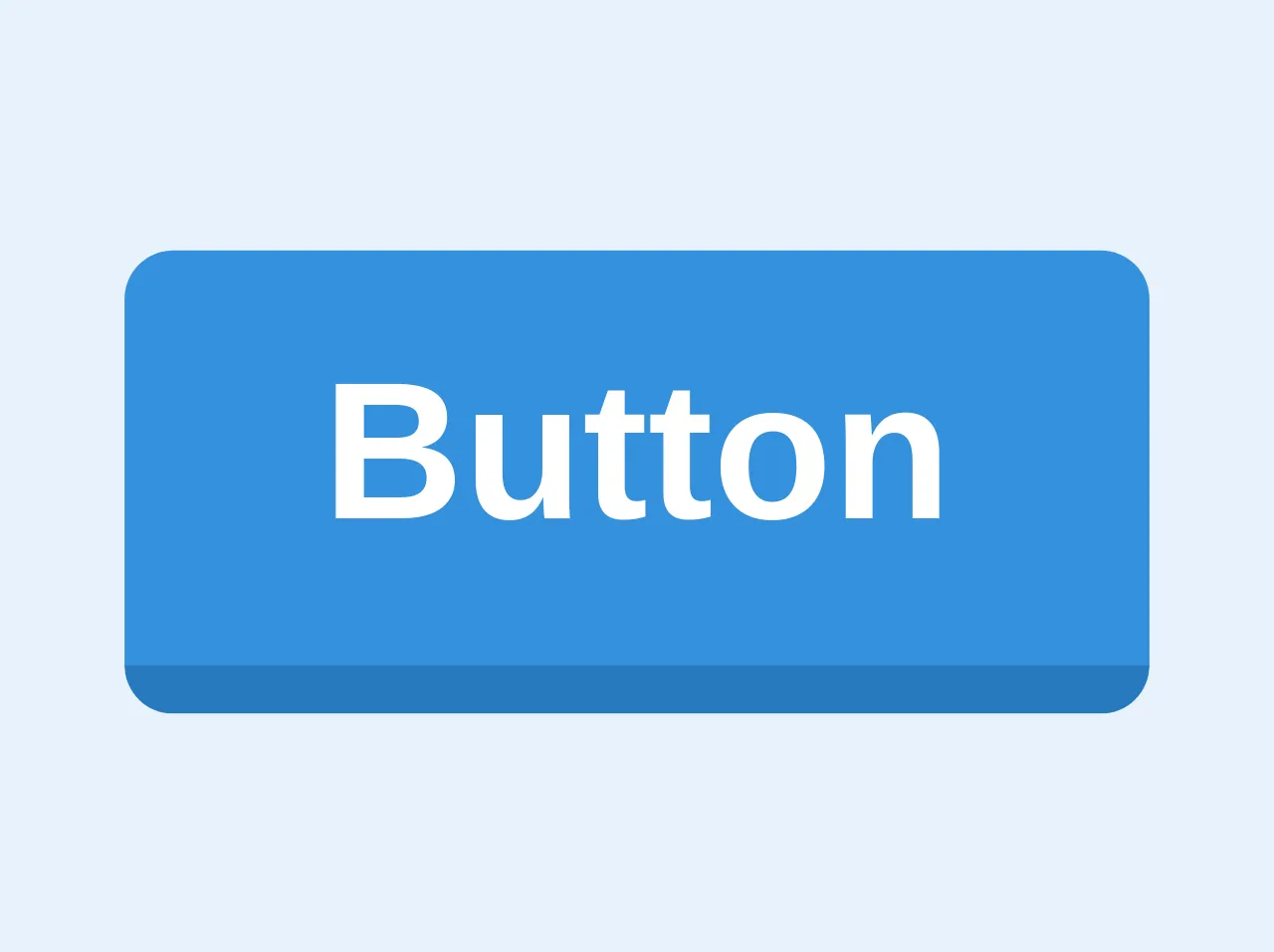
The source code of 3D button with push state ui component.
To create a 3D button with push state using Tailwind CSS, you can use the following HTML and CSS code:
<button
  class="bg-blue border-blue-dark hover:border-blue rounded border-b-4 py-2 px-4 font-bold text-white hover:border-b-2 hover:border-t-2"
>
  Button
</button>
How to create a 3D button with push state with Tailwind CSS?
Here are 6 tips to help you create a 3D button with push state using Tailwind CSS:
1. Choose a color scheme
The first step in creating a 3D button with push state is to choose a color scheme. You can use Tailwind CSS's pre-defined color classes or create your own custom colors using the --colors configuration option.
2. Define the button's size and shape
Next, you need to define the size and shape of the button. You can use Tailwind CSS's py and px classes to set the button's padding, and the rounded-full class to make the button circular.
3. Add a shadow
To create the 3D effect, you need to add a shadow to the button. You can use Tailwind CSS's shadow-md class to add a medium-sized shadow to the button.
4. Add a transition
To make the button's animation smooth, you need to add a transition. You can use Tailwind CSS's transition class to define the transition's duration and easing function.
5. Add a hover effect
When the user hovers over the button, you can add a hover effect to make it more interactive. You can use Tailwind CSS's hover class to define the hover effect.
6. Add an active state
Finally, when the user clicks on the button, you can add an active state to make it appear as though it has been pushed down. You can use Tailwind CSS's active class to define the active state.
Conclusion
In this article, we've discussed how to create a 3D button with push state using Tailwind CSS. By following these 6 tips, you can create a button that provides visual feedback to the user when they interact with it. With Tailwind CSS, you can easily customize the button's style to match your brand's design.